How to defer offscreen images
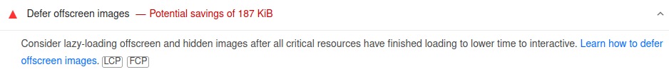
So you’ve run your website through Lighthouse for Chrome, or Google PageSpeed insights, and there’s a horrible red warning “Defer offscreen images”

So you’ve run your website through Lighthouse for Chrome, or Google PageSpeed insights, and there’s a horrible red warning “Defer offscreen images”. It’s a pretty easy one to fix, but may be daunting at first glance.
I have a couple of easy to use techniques that can help you solve this problem for any kind of web application. But first, why is it important to actually resolve this error?
Loading all offscreen images can have a serious impact on the performance of your website. Performance is your users first impression, it’s the first thing they experience, and it has a cumulative effect as they browse your site.
Good design, when it’s done well, becomes invisible. It’s only when it’s done poorly that we notice it.
– Jared Spool
Just like any other aspect of your user experience, you want performance to go unnoticed. Your users should be empowered to carry out whatever actions they need without the constant preoccupation that something’s not right. Great websites are pleasant to use and have an effortless experience. Anything-else will result in high bounce rates and lost business.
Don’t take our word for it though, according to research from Google, when your load times for a mobile website increase from 1 to 10 seconds, there is a 123% increase in the likelihood your visitor bounces. Not surprising really. 10 seconds is painfully slow, but not uncommon. The combination of large images and slower mobile connections can have a huge impact on performance.
It’s not just user experience though. Page speed is a ranking factor for Google search! So, you should definitely be factoring performance into your SEO strategy too.
I think you get the point, so let's earn them gains!
Lazy loading
The easiest option is to get your browser to do the heavy lifting. Just pop the loading=”lazy” attribute on all of your images and admire the performance boost.
<img
    src="/images/cute-cat.webp"
    alt="Meow"
    loading="lazy"
>
Okay, so, maybe it’s not quite that easy. Unfortunately, the loading attribute is only supported natively by the latest browsers. This may be okay depending on your requirements. Checkout Can I use for the full list of supported browsers.
Using JavaScript
So if we don’t have native browser support, we’ll need to employ a little JS to get this working. The lazysizes library offers exactly the functionality we need.
First we’ll need to include the library:
<script src="https://cdnjs.cloudflare.com/ajax/libs/lazysizes/5.3.1/lazysizes.min.js"></script>Now we just update our images, from this:
<img
    src="/images/cute-cat.webp"
    alt="Meow"
>
To this:
<img
    data-src="/images/cute-cat.webp"
    alt="Meow"
    class="lazyload"
>
Pretty easy, right. We’re just dropping the img src to prevent the browser from loading it, and allowing lazysizes to load it for us when the time is right.
We could even throw in a low resolution fallback image to show while our large image is loading:
<img
    src="/images/blury-cute-cat.webp"
    data-src="/images/cute-cat.webp"
    alt="Meow"
    class="lazyload"
>
This is great and works fine, but we can do better. For browsers that natively support loading=”lazy”, we’re unnecessarily loading an additional resource, so let’s fix that.
We can replace this:
<script src="https://cdnjs.cloudflare.com/ajax/libs/lazysizes/5.3.1/lazysizes.min.js"></script>With some custom JS to dynamically load the library only when we need it:
<script>
  //check if the browser natively supports the loading attribute
  if ('loading' in HTMLImageElement.prototype) {

    //find all the images that use with the loading="lazy" attribute
    const images = document.querySelectorAll('img[loading="lazy"]');

    images.forEach(img => {

      //check if each image has a data-src attribute value before copying it to
      //the images src attribute
      if (img.dataset.src) {
        img.src = img.dataset.src;
      }
    });

  //if unsupported, dynamically append the lazysizes script
  } else {

    const script = document.createElement('script');

    script.src =
      'https://cdnjs.cloudflare.com/ajax/libs/lazysizes/5.3.1/lazysizes.min.js';

    document.body.appendChild(script);
  }
</script>
Now we just need to add loading=”lazy” to our images:
<img
    src="/images/blury-cute-cat.webp"
    data-src="/images/cute-cat.webp"
    alt="Meow"
    loading="lazy"
    class="lazyload"
>
Modern browsers will now use their native functionality, and older browsers will show a low resolution fallback image until lazysizes loads the full resolution version.
Share this post

George Palmer
Senior developer at Honeystone and Co-Founder of TypedCMS.
Not a copywriter, or even a good writer, but I do like to write the occasional blog post.